![]() With so many people using twitter we thought we would go over some of the things you need to consider when designing a Twitter Background for your Profile Pages.
With so many people using twitter we thought we would go over some of the things you need to consider when designing a Twitter Background for your Profile Pages.
Adding additional information in a background image can help your twitter followers understand who you are and what you like.
If you are designing a personal background then you can be as light hearted as your personality allows but if you are designing a public profile for a professional reason then you should take your design choices seriously.
 Copyrighted Images
You should limit your use of copyrighted and trademarked information to those that you have permission to use or those that you created yourself. If you are a professional bloger that talks about different Movies or Stars you never want to use copyrighted materials or logos and the same is true for any professional business.
Government websites are a great resource for images. Every documet image or picture that a government employee makes in course of their job is considered public domain because you pay their paycheck. There are limits though you can not use official seals or things like pictures of money.
If you use Google Images to find pictures add the search field at the end that will limit returns only to .gov websites such as [Paris Hilton site:.gov] that will return all the images of Paris on government public server but before you just use those images make sure they are not copyright protected or restricted.
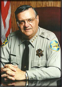
Now you might not find a picture of Paris Hilton but you might find a picture of this guy Sheriff Joe who is just as lovable.
Laying Out your Design
Twitter uses a centered page for display of its content this means that you can place graphics on the left side of the image about 160px in from the left side and expect that most of your profile visitors will see your info.
The space to the right side of the page content should not be used for text information however you can place the remainder of your graphics upto the size of the browser that you want to support.
Full screen on a 17 to 22 inch monitor will produce different results and much of the area will be hidden when your visitors have their browsers less then fully expanded.
Tiles and Patterns
Patterns are great if they are seamless. You do not want to use a basic image and tile it if it has not been prepared to tile seamlessly. This means all of the edges are compatible when the image is duplicated to fill the page.
There are a number of free sites out there on the web to find seamless pattern images. You want to use one that is large enough that you won’t notice changes when viewing the page.
File Formats
Although PNG and GIF formats are available for uploading you should probably stick with a .Jpeg image. This will give you the best results and highest compatibility.
ICON SIZES
Your profile Icon that is placed next to all of your posts should be uploaded at 73px X 73px for best results. Smaller versions of your icon will be used in other places but are based on the larger size. Don’t try to fill the icon with text info. While working on your design make the image proportionally larger then you will save it then reduce it to the smaller size for uploading.
Help Sites
If you are a graphic klutz or just don’t have a decent image processor at your disposal then there are a few sites that can help you make a design.
http://www.freetwitterdesigner.com/
http://www.patterncooler.com


